Thursday, 18 April 2013

My website homepage


This is my website homepage that I have created. I used Photoshop to create this and believe it is very successful. I used the conventions of other homepages that I researched to get inspiration and so I would have an idea about what I wanted mine to look like. When I first chose my background, it was a pale pink colour which I believed worked well due to my artist being directed more towards the female gender however I then thought pink was too feminine and chose on this pale blue colour. After looking at existing websites, I could see most of them had tabs somewhere so there would be a link to go to a different page of the site. Although mine is not a real site, I wanted it to look as realistic as possible so created these fake 'hyperlinks'. To keep in with social media, I made sure I have icons for networking sites such as Twitter and Facebook - this was to ensure that everything looked modern and up to date. These links are found below the mast head.
Promotion is also a big part of homepages as it shows their 'fans' their current singles, tour dates and more. To promote my artist I print screened a thumbnail of my YouTube video to put on the website to look as if it were a link to watch it. As well as this, I added the album cover I have made, along with a 'news feed' and music player.
I believe my homepage is creative and I have achieved what I was hoping for when thinking about ideas.

Choice of fonts


For my ancillary tasks, I wanted to choose a font that I could use in each product, this is so it can be consistent throughout and the audience can tell that they all relate together. This seemed to be a media convention after looking in to all my format research; it seems that the artists such as Ed Sheeran and Ben Howard use the same fonts. The main fonts that I liked when on 'dafont.com' are the ones below. I wanted to pick one that was relaxed and kind of as if it is hand written, this is due to acoustic artists usually being song writers as well as singers and therefore these fonts would relate to that aspect.
The font that I have chosen is the 3rd as I believe it is perfect for what I want to achieve as well as being clear for the audience to read.


Choices of images

These are my final choices of images from my photo shoot which I believe portray interesting composition, lighting and colour. All these images I have chosen to be my final images are all ones in which Ollie is lookign away from the camera. I wanted to do this so there was more of a relaxed feel instead of it being intense. I will edit them using Photoshop so they look more proffessional for example, whiting teeth, airbrushing and increasing contrast - this is shown in the second image displayed below which has already been edited. I also think I may put them in black and white, this is so it clearly links in with my music video.


Front Cover of digi pack


Magazine Advert
 

CD


Inside left - Digi pack

Back cover of digi pack


Mock up homepages

I made this mock up on Photoshop to give me a rough idea of what I wanted to do when it came to completing my website homepage. I will use this as I guide as from my format research, these seem to be the conventions of a singers website homepage.


Photo shoot


Due to my ancillary tasks consisting of website homepages, digi packs and adverts, I needed to do a photo shoot consisting of different angles, shots, costume, settings and props so I could get a variety of photographs that I can then choose from when creating my ancillary tasks. This video shows all of the photographs that I took - unsuccessful and successful. Although I have a range of successful images, I will still edit some to make them look more proffessional.

Format Research: Website homepage 3


I don’t believe there is a main focus on this homepage due to it being rather busy and having consistent fonts throughout and therefore making the website seem branded. However, the audience is directed to the masthead at the top of the page stating the name of the artist. The font is in a simple ‘Arial’ style which contrasts with the other artists homepages that I have looked at. The second aspect that draws the audience’s attention in is the central image. The audiences attention in is the central image. The photograph used is the front cover of Ben Howard’s album and is a way of promoting his music. The image is covered in text showing the most recent new updates including live streams. The text is in white so it stands out against the central image and the audience’s attention is more drawn to it.
  Above the masthead are the different hyperlinks that direct the viewers’ to different pages within the website, evidently they are the homepage, news, blog, ‘live’, biography, music, video, gallery, store and where to sign up. These are ways to keep up to date with the social media as well as other pages that fans would be interesting in reading. The links shown on this page is what I’d expect to see on any homepage and this is why I will be taking inspiration from here when designing my own website homepage.
In the top right hand corner, there is a music video where the audience can play Ben Howards latest songs. This is another way in keeping with the social media as well as promoting his songs however because it isn’t very big, this suggests it isn’t an important aspect of the page itself.
Finally, an aspect to consider is the colour scheme. Evidently this homepage has a mixture of cold colours which contrasts with the warmer colours used in the other two homepages I have also analysed. I believe the colours are directed towards a wider audience than the other two. Ed Sheeran and Damien Rice appear to target 14 to 24 year olds whereas Ben Howard shows it to be more organised and sophisticated therefore possibly directing it to 18 – 30 year olds. When designing my homepage I will take inspiration from each however I will be concentrating more on a younger target audience.


Format Research: Website homepage 2


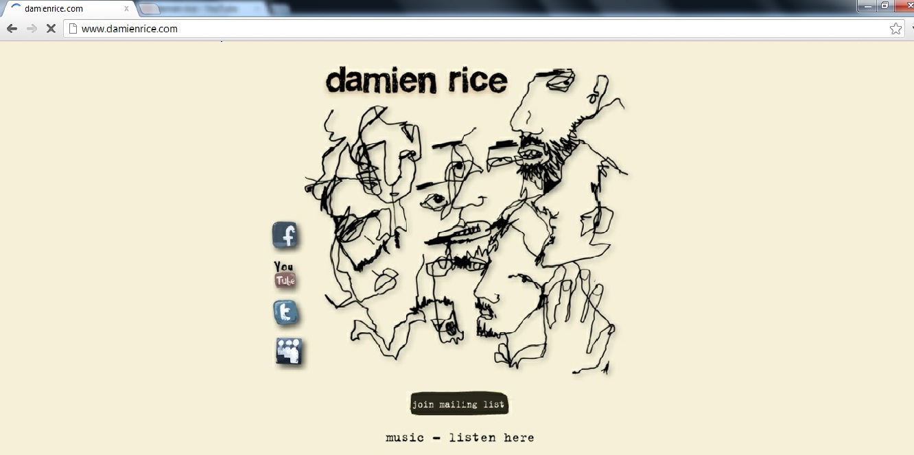
The central image is what instantly attracts me when looking at this website homepage is which is unusual due to it usually being the masthead that is the focus. The image takes up most of the page which is why I believe it is the main focal point. The picture in the centre relates to the artist because although it not himself, the drawing is similar to a few of his album and single covers which are also in this ‘scribble’ style. The masthead is the second aspect that draws in the viewers. It evidently states the artists name ‘Damien Rice’. The font used is also in the same ‘scribble’ style and is quite messy. This makes it seem branded however not as much as ‘Ed Sheerans’ Homepage which has consistent colours and fonts throughout. Acoustic artists all seem to have this style of writing, it may relate to the fact, acoustic artists are usually singer-songwriters and therefore the style of writing is like they have written it themselves. The messy theme also seems like it is very laid back and relaxed like the genre of music. I believe that the washed out colours are also interesting and contribute to the fact it is relaxing music as the stone washed colours remind me of being at a beach.
    To the left of the page are hyperlinks to the different social networking sites, Facebook, YouTube, Twitter and MySpace. These are a way of marketing and promoting the artist due to them being linked to fan pages. It also shows that Damien Rice is directing his homepage to a younger target audience who are more likely to be on the social networking sites. Other links include ‘join the mailing list’ which is highlighted black. This makes it seem more important to the viewer as nothing on the homepage is highlighted like this. Below that is evidently a link to where you can listen to Damien Rice’s music - promoting the artist further.
  Unlike some of my other format research the fonts vary in this homepage. This makes it seem less organised however because the homepage isn’t too busy. Each aspect of the page stands out anyway. Looking at the other two website homepages I will analyse, this one is the most simple and doesn’t have any hyperlinks to ‘news’ pages or information about the artist. When I design mine, I will make it a bit busier and include more puff and hyperlinks so my artist seems more promoted.