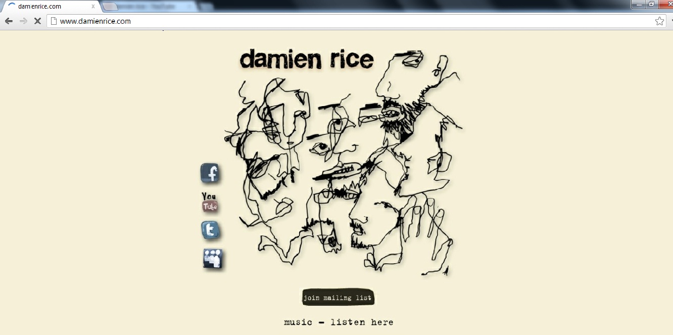
The central image is what instantly attracts me when looking at this website homepage is which is unusual due to it usually being the masthead that is the focus. The image takes up most of the page which is why I believe it is the main focal point. The picture in the centre relates to the artist because although it not himself, the drawing is similar to a few of his album and single covers which are also in this ‘scribble’ style. The masthead is the second aspect that draws in the viewers. It evidently states the artists name ‘Damien Rice’. The font used is also in the same ‘scribble’ style and is quite messy. This makes it seem branded however not as much as ‘Ed Sheerans’ Homepage which has consistent colours and fonts throughout. Acoustic artists all seem to have this style of writing, it may relate to the fact, acoustic artists are usually singer-songwriters and therefore the style of writing is like they have written it themselves. The messy theme also seems like it is very laid back and relaxed like the genre of music. I believe that the washed out colours are also interesting and contribute to the fact it is relaxing music as the stone washed colours remind me of being at a beach.
To the left of the page are hyperlinks to the different social networking sites, Facebook, YouTube, Twitter and MySpace. These are a way of marketing and promoting the artist due to them being linked to fan pages. It also shows that Damien Rice is directing his homepage to a younger target audience who are more likely to be on the social networking sites. Other links include ‘join the mailing list’ which is highlighted black. This makes it seem more important to the viewer as nothing on the homepage is highlighted like this. Below that is evidently a link to where you can listen to Damien Rice’s music - promoting the artist further.
Unlike some of my other format research the fonts vary in this homepage. This makes it seem less organised however because the homepage isn’t too busy. Each aspect of the page stands out anyway. Looking at the other two website homepages I will analyse, this one is the most simple and doesn’t have any hyperlinks to ‘news’ pages or information about the artist. When I design mine, I will make it a bit busier and include more puff and hyperlinks so my artist seems more promoted.
No comments:
Post a Comment